Enabling Special Visualizations
This guide explains how to enable special visualization features in your Visual KPI Designer environment. These visualizations enhance data presentation, providing end users with more intuitive and engaging ways to interact with key performance indicators.
The features covered in this guide are:
These features are only available to end users after they are enabled through the Visual KPI Designer. This guide provides step-by-step instructions for configuring each visualization.
Geo Map
The Geo Map visualization allows end users to view KPIs overlaid on a Google Maps interface, providing a geographic perspective on performance data. This powerful visualization helps users identify trends, patterns, and outliers based on geographic location, making it ideal for location-sensitive metrics.
Enabling the Geo Map Visualization
To enable the Geo Map feature, the Designer must configure location information for the relevant KPIs by specifying values in the Latitude and Longitude columns of the KPI configuration. To do so, follow the steps below:
-
Open the KPI configuration table in the Visual KPI Designer.
-
Locate the Latitude and Longitude columns for the relevant KPIs.
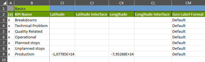
- Enter each KPI's geographic coordinates (latitude and longitude).
Once you save this information, the Geo Map visualization will be available to end users. If the user selects the View as Geo Map () option, the system will generate an overlay displaying the KPIs on Google Maps.
KPI Image Overlay
The KPI Image Overlay visualization provides a flexible and customizable way to overlay KPI data on images. Designers can use this feature to create interactive, visually rich displays that allow users to engage with KPIs in the context of a specific image, such as a floor plan, schematic, or process map.
This highly customizable visualization allows designers to create tailored experiences that match specific business needs. For example, you can map KPIs to a facility layout, overlay data on production line schematics, or create clickable regions for navigation and deeper data exploration.
Enabling and Configuring the KPI Image Overlay
The KPI Image Overlay is a chart type that must be configured by the Designer. End users can view and interact with the overlays but cannot modify them. Follow these steps to enable and customize this feature:
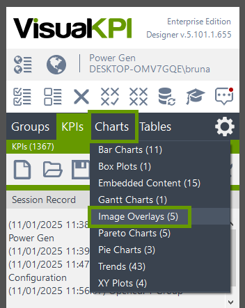
- In the Visual KPI Designer, navigate to the chart types and choose the Image Overlay option.
- Open (
 ) an existing overlay or create a New (
 ) one.
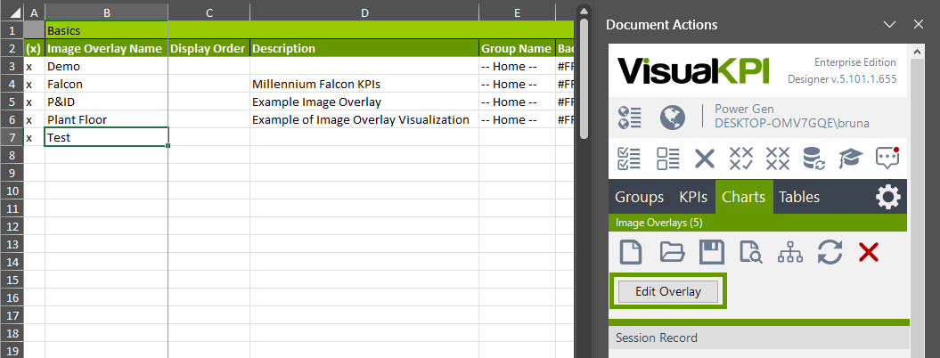
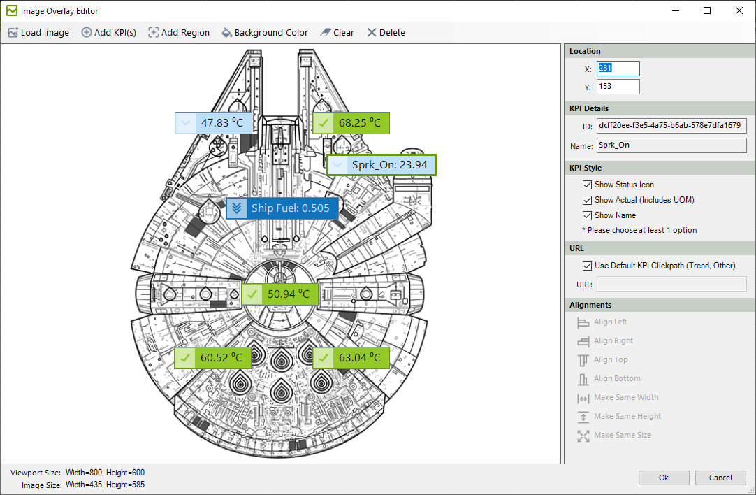
- With the line for the desired image, click the Edit Overlay button to access the overlay editor. This tool allows you to:
- Load an Image: click on Load Image to select the background image.
- Add KPI(s): Search for and select KPI(s), then drag and place them in specific locations on the image.
- Add Region: Define clickable regions on the image for group actions or interactions.
- Background Color: Match or customize the background color to blend seamlessly with the image, especially when using transparent images.
-
With a KPI selected, you can edit specifics in the side menu:
- Location: Edit the location of that KPI by assigning specific X and Y values.
- KPI Details: Check KPI's ID and Name.
- KPI Style: Choose at least one of the three options to show on the Image Overlay.
- URL: Either choose the Use Default KPI Clickpath or inform a URL for when the user clicks the KPI.
- Alignments: With two ot more KPIs selected, choose possible alignments.
-
Save the configured overlay and, if needed, assign the overlay to a group for organization within the system.
Once configured, the KPI Image Overlay becomes available as a chart type for end users. They can find it by clicking the Charts option in the sidebar and scrolling down to the "Chart Type: Image Overlay" section. Users can add the desired Image Overlay to a Dashboard or interact with it in the same way they can interact with other charts.